This project centers on the design of a custom monospaced typeface, built within a strict 4x4 modular grid using block-based forms and rounded corners. The goal was to explore how expressive and functional a mono typeface can be when constrained by geometric structure.
Each letterform adheres to the fixed-width grid, creating consistency and rhythm across the alphabet. Special attention was given to numerals, which were designed to clearly distinguish themselves from letters—for example, the number 0 features a sparkle shape at its center to avoid confusion with the letter O, while the 2 has a unique curve unlike the letter Z.
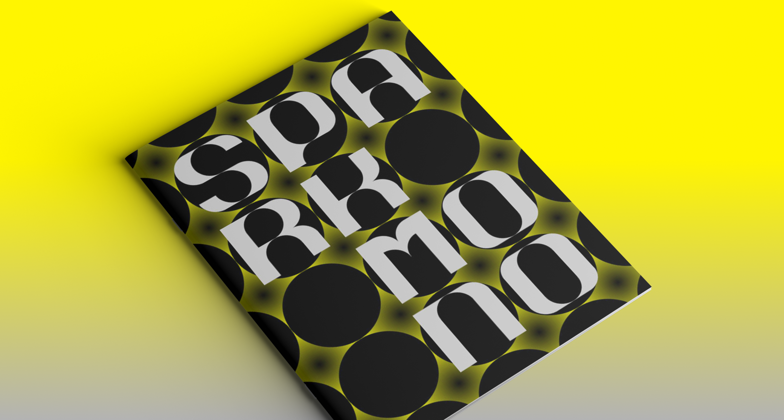
The accompanying type specimen book uses a limited palette of black, yellow, and white, showcasing the typeface in motion and in layout. A recurring sparkle graphic is woven throughout the book as a playful decorative element that reinforces the character of the type system.
.png)
.png)
.png)
